Text Block Characteristics of
Two Known States of The Titanic by Elbert Hubbard
(The Roycrofters, 1923)


This text is copyrighted 2009, but may be reproduced for any non-profit purpose without cost so long as credit is given and no changes are made. Written permission must be obtained before quoting portions of this text in any for-profit document, electronic or otherwise.


Elbert Hubbard and the Sinking of the RMS Titanic

Shortly after the sinking of the Titanic on April 14th, 1912, Elbert Hubbard penned a brief memorial to that tragedy, and to the bravery of those who sacrificed their lives so that others, mainly women and children, could live. That memorial was first published by the Roycroft Press in Hollyhocks and Goldenglow in 1912 and again, separately, in 1923, under the title The Titanic.

Ironically, Hubbard and his second wife, Alice, were both killed when the Lusitania was torpedoed by the Germans on May 7th, 1915. Ernest Cowper's letter to Hubbard's son regarding the conduct of Mr. and Mrs. Hubbard during that time shows that, at the very least Hubbard did his best to emulate that calm bravery he so admired in those men and women of the Titanic disaster.


Synopsis

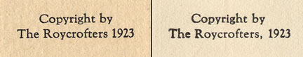
In the text of the two known states there are variation in floral embellishments, font style, capital letters, tracking/kerning and even in one case, color. What follows is a comparison of the title pages, versos and the first page of the actual text.
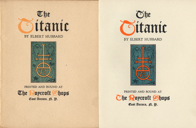
There are a handful of copies of this title with different dust jackets. I have seen one copy with an orange printed dust jacket, one with a thin unprinted acidic laid paper jacket and a third with an unprinted dark grey marbled paper jacket. The only binding examples I have seen are those in limp suede, most brown, one in a deep purple.


Title Page

Here are the two title pages side-by-side. On the left is state A; on the right is state B.

State A

· T of 'The' on both 'The Titanic' and 'The Roycroft Shops' is in a different font than the T of Titanic

· T of 'The' in 'The Roycroft Shops' is in BLACK ink

· 'Titanic' is widely spaced, measuring 55 mm.

· Colors are pale sea green for the sea-themed lozenge and pale orange for the following Capitol Letters:

T in 'Titanic'

R in 'Roycroft'

S in 'Shops'


State B

· T of 'The' on both 'The Titanic' and 'The Roycroft Shops' are in the same font as the T of 'Titanic'.

· T of 'The' in 'The Roycroft Shops' is in RED ink, as are the R of 'Roycroft' and S of 'Shops'.

· 'Titanic' is spaced more narrowly, measuring 51 mm.

· Colors are pale blue for the sea-themed lozenge and bright orange for the following Capitol Letters:

T in 'Titanic'

T in 'The' of 'The Roycroft Shop'

R in 'Roycroft'

S in 'Shops'


Verso

· State A has no comma after 'The Roycrofters', while State B does.


I am particularly interested in hearing from anyone who has either of these states of The Titanic for the purposes of creating a 'survey' to determine the relative scarcity of the two states and perhaps resolving the question of priority. All information except for the number of copies of either state extent will be held as confidential. Anyone wishing to contribute information about this title is encouraged to email me using the link below. Questions and comments can be addressed to the same account.


Karl E. Ziellenbach - last revised March 9, 2009